 Have you ever seen a font you love but don’t know the name of it? There are hundreds of font sites & foundries on the internet & trying to search each & every one can turn into a nightmare.
Mr ExD paints commercial signs by hand … shop signs, window signs, blackboard signs – you name it, he does it. Over the years we have developed a system where I set up the lettering to scale using my design software, print it off & he uses this as a template.
Generally we have a fair bit of freedom with font styles. Clients often have a vague idea of what they want … script & capitals, old style, pictorial etc. That works fine until we need to match branding & the client is clueless what font has been used because they don’t have a brand style guide!
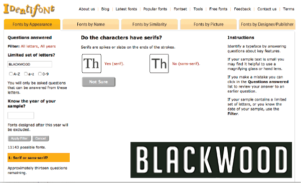
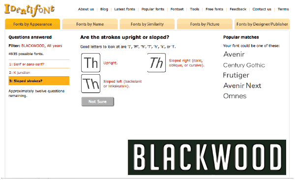
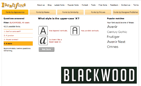
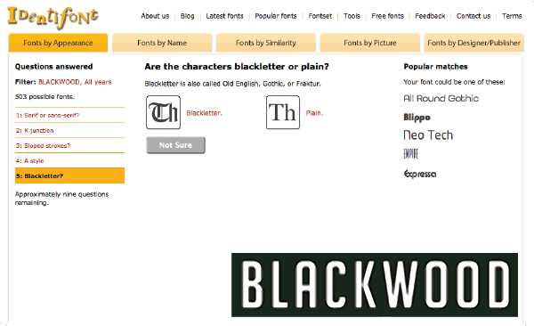
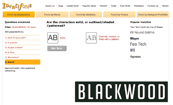
Usually I have a small number of letters to work with from the logo so with that I go off & do research. Enter one of my favourite tools – IDENTIFONT. Identifont is an independent, internet directory of free digital fonts as well as those available for purchase. It uses a set of easy tools to match typefaces to your answers to a set of visual questions. Let me show you how it works…
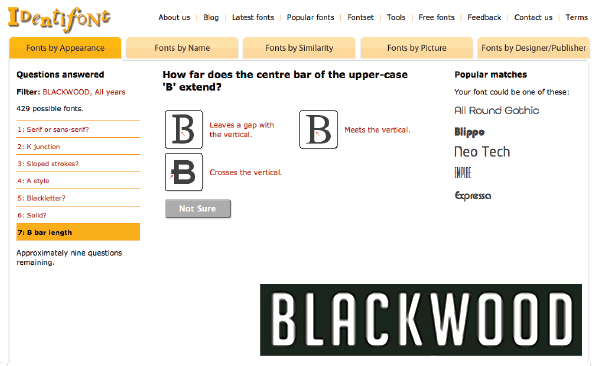
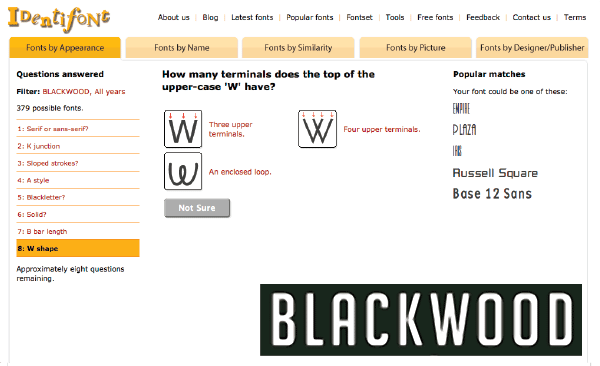
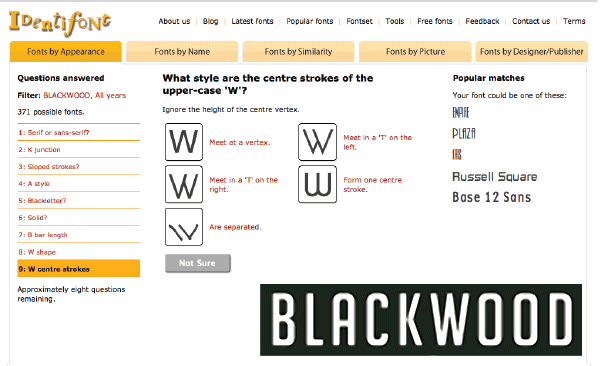
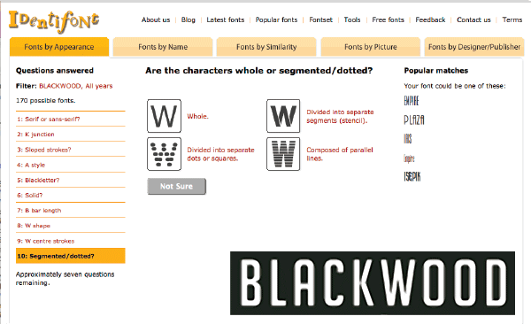
 The image I’m working with is a single word from the clients logo. There are a number of distinctive elements in individual letters which I will be looking for.
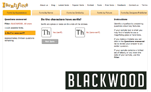
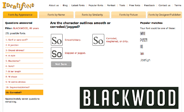
It’s a narrow bold font. Sans serif (no little tails at the end of strokes). The letter ‘A’ has a rounded top, the ‘O’s’ have squared corners & the ‘K’ meets in the center of the upward stroke. So let’s see how we go finding out the name of the font … or at the very least getting a near match
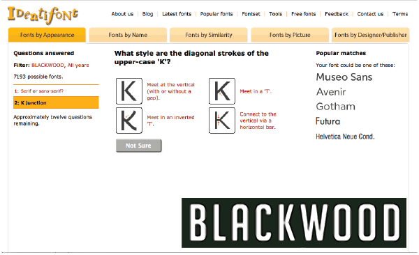
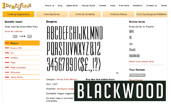
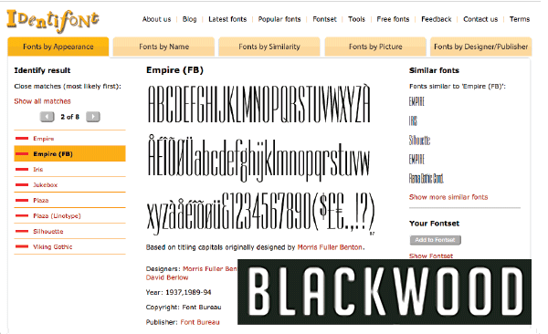
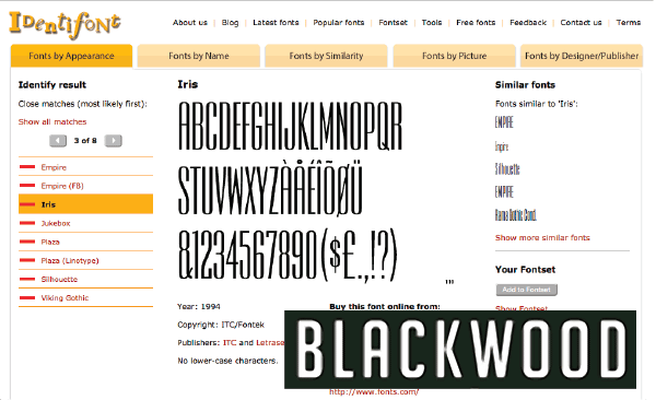
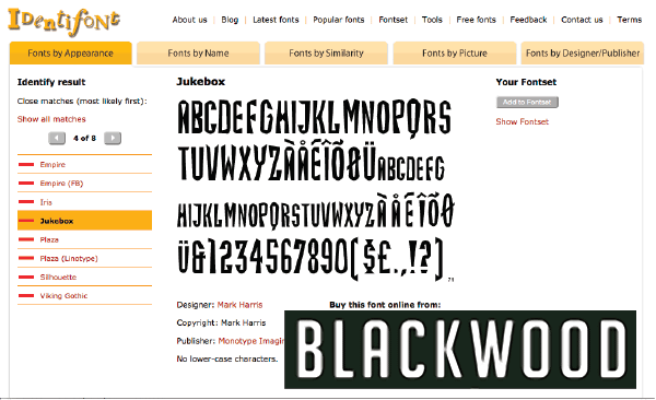
All the fonts identfont has given me are fonts I don’t have in my collection. Now, if the font was a perfect match I would be happy to pay for it & pass the cost onto the client, however none of them are a perfect match. So it’s back to the drawing board.
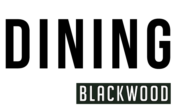
I actually don’t need to replicate the word “Blackwood” in this sign, but we need to use the client’s branding to write the word “DINING”. With that in mind a strong recognition of the distinct characteristics of the font, I went searching through my collection of fonts.
Voila, I came up with Bebas Neue which is really close. I kerned the letters (adjust the spacing between the letters) & voila, who would know the difference at a glance?
Next time you’re looking for a specific font, give identifont.com a try?
We’d love to hear how you go, please post a comment below…