The importance of using images & other graphics on websites, blogs, & social media can’t be understated.
Today, our extensive use of social media has turned us into ‘scrolling people’. We just scroll our way through Facebook, Instagram, Twitter, & the interwebs until something visually enticing catches our attention. There’s no denying the fact that written content has its own importance, but what’s working like magic these days is a combination of quality written content & visually attractive graphics.
Creating Stunning Visuals: Tools That You Can Use
Listed below are some tools that you can use to create stunning visuals for your website, blog, or social media platforms.
Canva
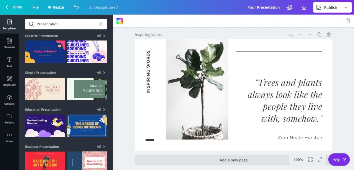
Don’t know how to use Photoshop but want to create images that can work really well on your social media? Check out Canva[1].
This great online tool offers loads of pre-made designs for almost every social media platform. Now, you can design stunning visuals with just a few clicks. The best thing about Canva? It’s totally free! However, some images & elements do come at a cost. You can upgrade to the Pro version for extra goodies & tools.
Adobe Spark
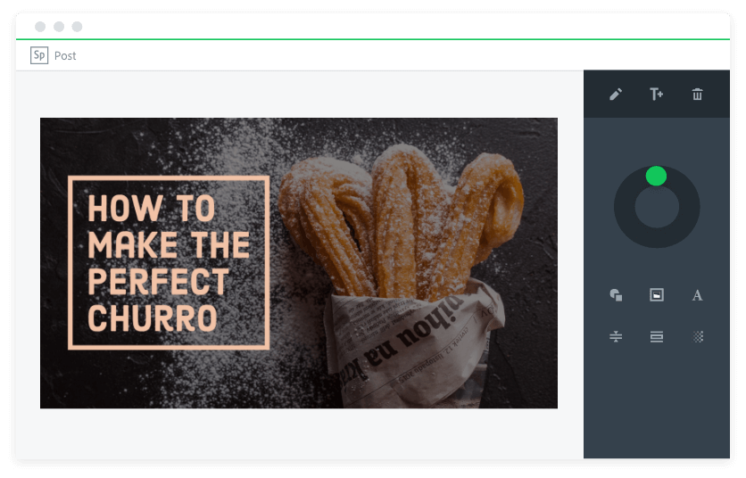
Looking for the right balance of power & minimalism in your design tool? Try Adobe Spark[2]. Choose from dozens of professional templates organised by design type, size, & category, then customise that template with Spark’s easy-to-use tools. Replace template images with one from Adobe’s royalty-free library, or one of your own uploads.
Unlike other design tools, Spark makes it easy for you to change the design layout (or even the whole template) from one of the sidebar menus, so you don’t have to go all the way back to the start page if you want something different. If you’re looking for some inspiration, Spark also offers pre-formatted designs & text styles that you can choose from.
Stencil
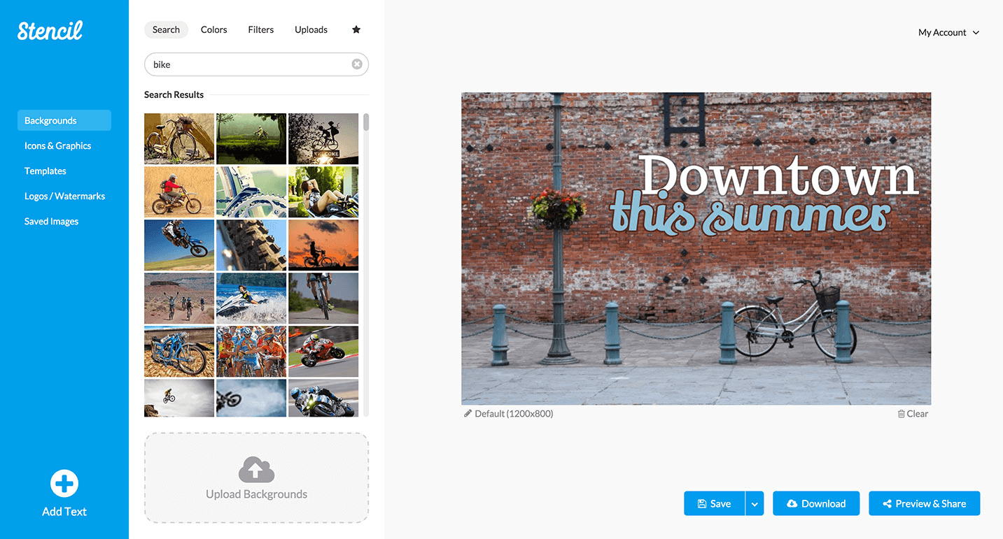
Want to create eye-catching social media graphics? Use ♥ Stencil[3]! Stencil is an easy-to-use graphic design & image creation tool for bloggers, social media marketers, & business owners. With this tool, you can easily create stunning images for ad graphics, social media posts, emails, presentations, blog/website images, or just about anything! Even non-graphic designers can benefit from Stencil thanks to its user-friendly features.
All of the icons & photos in ♥Stencil are safe to use & are royalty-free! They are sourced from reputable providers & can be used commercially or personally, with no attribution required. ♥Stencil offers over 1.4 million photos, 1 million icons & other illustrations, 650 templates, & over 2,000 Google Fonts! ♥Stencil also offers 38 optimized sizes, so you can have the perfect image for the social media sites that you want to use. If you already have icons, images, & other visual content you’d like to use, you can simply upload them to the ♥Stencil platform.
Creating Stunning Visuals: Going Beyond the Tools
Canva, Adobe Spark, & Stencil are just three (of the many) tools that you can use to create stunning visuals.
However, no matter what software or design tools you use, if you don’t understand the basic principles of graphic design, you won’t be able to create eye-catching visuals that’ll help you stand out.
To create stunning graphics, here are some basic design principles that you should keep in mind.
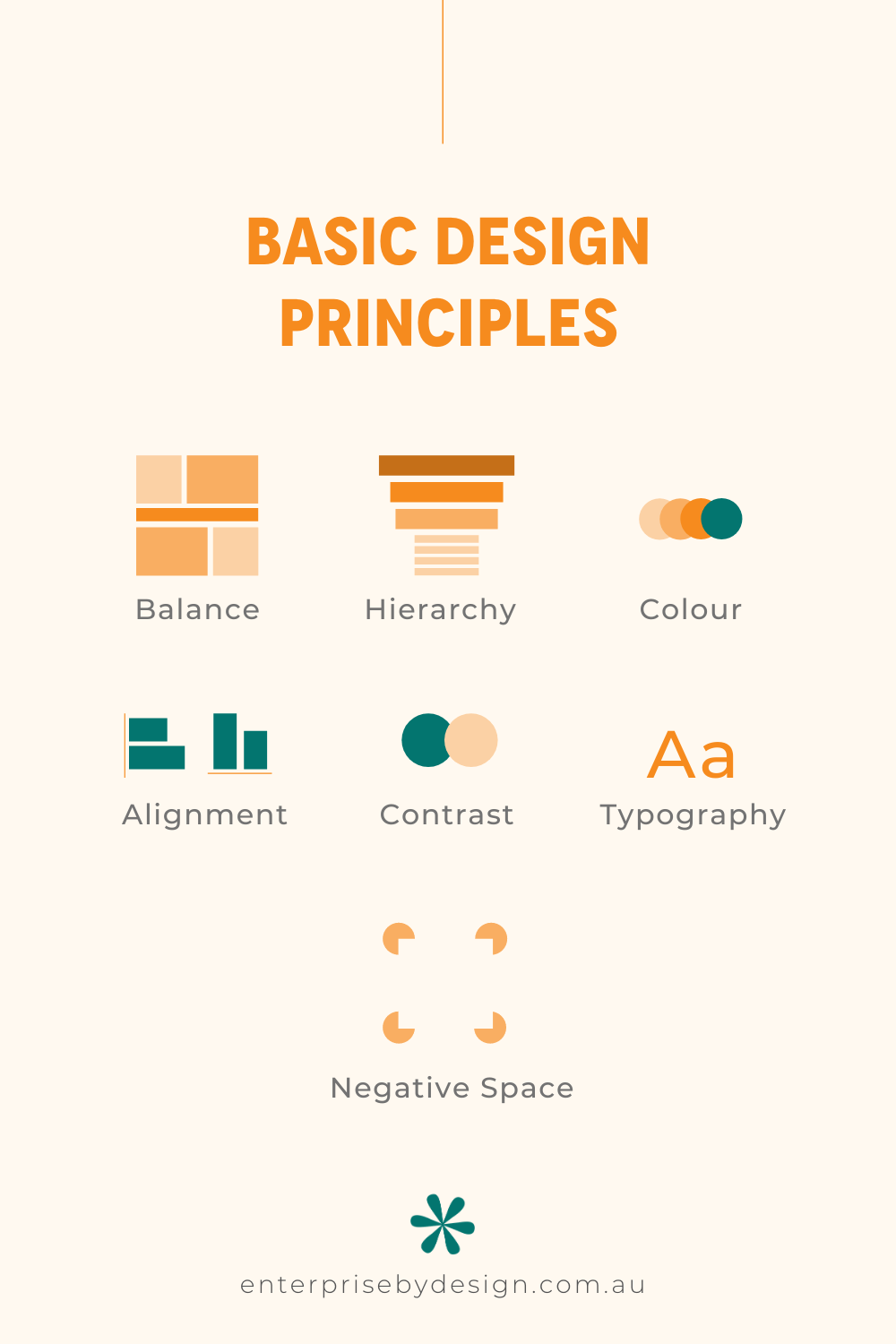
Balance
Balance provides structure & stability to an overall design. To understand it better, imagine there’s weight behind each of your design elements (e.g. images, shapes, & text boxes). You need to make sure that the weight behind these design elements are equal & that one doesn’t outweigh the other.
However, this doesn’t mean that elements always need to be equal in size or distributed evenly – balance is either asymmetrical or symmetrical. Asymmetrical balance uses contrast, colour, & scale to achieve the flow in design. On the other hand, symmetrical balance is when the weight of elements is evenly divided on either side of the design.
Visual Hierarchy
A visual hierarchy is formed when extra weight is provided to the most important message or element in your design. This can be achieved in various ways – you can use bolder or larger fonts to highlight the title; add focus to larger, more colourful visuals than smaller, less relevant images; or placing the key message higher than other design elements.
Colour
Colour is a vital design basic & it establishes the overall mood of a design. The colours that you choose represent your brand & its tonality, so be careful with the palette that you choose. It’s always helpful to have a basic knowledge of colour theory. For instance, warm colours like red, yellow, & orange signify passion & energy; while cool colours like blue, green, & purple are usually calm & relaxing. Colour palettes can be used to complement different elements or as a contrast.
Alignment
Alignment plays a critical role in creating a seamless visual connection between design elements. It provides an organised appearance to shapes, images, & blocks of texts by eliminating elements placed in a disorganised manner.
Contrast
Contrast occurs when there’s a difference between two opposing design elements. The most common types of contrast are light vs. dark, old-fashioned vs. modern, small vs. large, etc. Applying contrast to your graphics can guide a viewer’s attention to key elements, while ensuring that each side remains visible & legible.
Typography
Typography is one of the key pillars of graphic design, & it speaks volumes about a brand when executed stylistically or even customised. Typography is about adjusting the text within your design, while creating powerful contents. It preserves the aesthetic value of your contents while providing it with an attractive appearance. Typography plays a significant role in setting the overall tone of your design concept.
Negative Space
We’ve talked about the importance of images, shapes, & colours, but what about the space that’s left blank? This is known as “negative space” – the area around or between the elements. If used creatively, negative space can highlight the important elements of your design. It also provides a “breathing room” for all the objects & elements on the page.
Final Thoughts
Creating stunning visuals is more than just using the right tools – you need to understand graphic design basics too.
Understanding graphic design basics – such as balance, colour, visual hierarchy, typography, & negative space – is crucial for creating visuals that are in-line with your vision, messaging, & overall brand as well as getting your message seen.
