
Canva is a brilliant tool for creating beautiful images in your blogs and making it stand out. However, scrolling through Canva’s 100+ fonts to find what works for your message will eat up more of your time than it would to write your blog. A definitive brand style guide will become your go-to document.
Font Categories
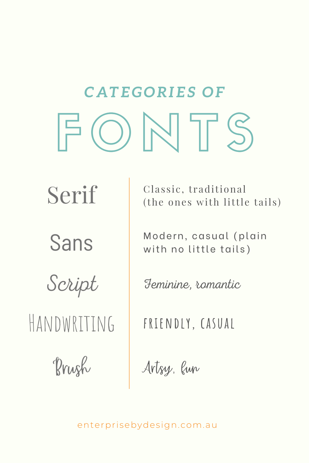
To explore your options, the best place to start is learning about Font categories. They are a way of grouping and classifying fonts. Canva has 4 main font classifications- serifs, sans serifs, decorative style and scripts. Each of these has several subcategories which gives you more flexibility to make your blog more impactful. Script type, for instance, have Formal, Casual, Calligraphic, Blackletter & Lombardic styles.
To simplify this article, we will use these 5 categories:
- Serif (the ones with little tails): Traditional and classic
- Sans Serif (plain without tails): casual and modern
- Handwriting: Casual and friendly
- Brush Script: Fun and artsy
Once you have decided what font category works best for your project (or brand), it’s time to choose which font combo you want to use. The lists below will give you an idea and the best place to start.
What fonts work best & where?
Headings (these should be clean & bold)
In the web world, headings are written in code – for instance <h1>Heading Here<h1> is the main heading. For Google love you should only use the H1 tag once in a page or post.
Major Heading
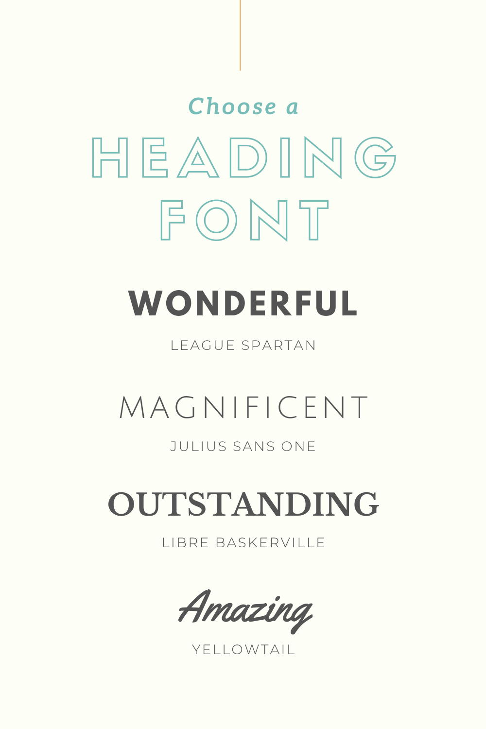
Abril Fatface | Aileron Heavy | Amaranth | Cooper Hewitt Heavy | Hammersmith One | League Gothic | Lillita One | Open Sans Extra Bold | Oswald | Raleway Heavy
Subheads (these compliment main headings but can also be used in main headings)
When the Google God goes through your page, he/she can tell the most important information to the least important information through heading tags.
<h2>heading two </h2>
<h3>heading three </h3>
<h4>heading three </h4>
<h5>heading three </h5>
<h6>heading three </h6>
Subheadings
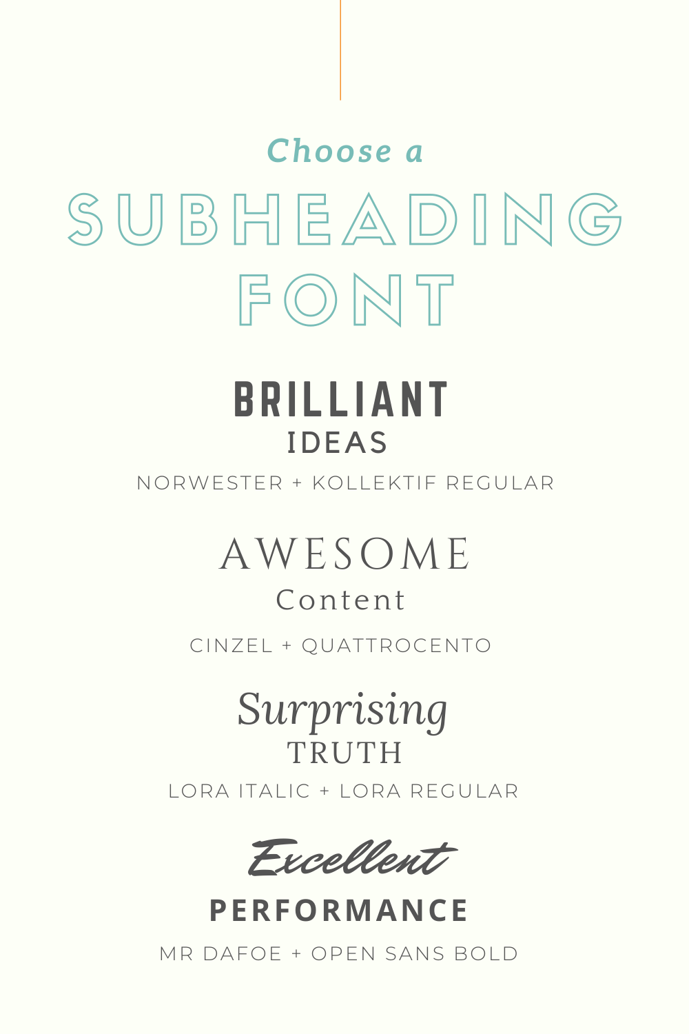
Aileron Thin | Aleo Light | Cantora One | Cooper Hewitt Thin | Coustard | Glegoo | Granaina | Julius Sans One | Kollektif | League Spartan | Merriweather | Montserrat | Quando | Quicksand | Raleway | Sanchez | Vidaloka
Body Text (this is where legibility is super important: most legible size is 14-16)
Traditionally, serif fonts are used in printed works while sans serif are used digitally because they are easier to read on a screen.

Aileron Regular | Alike | Antic | Arimo | Bodoni FLF | Droid Serif | Gidole | Lato | Lora | Roboto | Vollkorn
Script (use for highlights or very short headlines & usually contain 1-2 words)
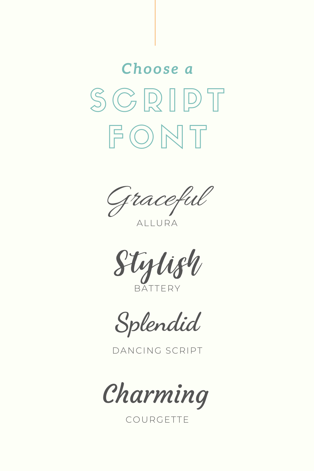
Allura | Brusher | Clicker Script | Courgette | Euphoria Script | Grand Hotel | Great Vibes | Kaushan Script | Mr Dafoe | Niconne | Oloe Script | Parisienne | Pinyon Script | Satisfy | Yellowtail
Where-ever fonts: The name says it all.
These are safe to use anywhere and everywhere. So, worry no more!

Helveticish | Libre Baskerville | Open Sans | PT Sans/Serif
Font combos
Great font pairings mean great design. Some fonts look good together while others are deadly enemies. Pairing the right fonts makes or breaks your design. This can be tricky, though- one serif font may work great with this heading and not the other.
You want your font choices to have a good contrast, too. For instance, pairing Aileron Thin as your heading and Open Sans Light for your body text is not a good idea because they are both light and rounded.
Font pairings also depend on your brand and your message- what works beautifully in a kiddies shop will not work for a hipster bar.
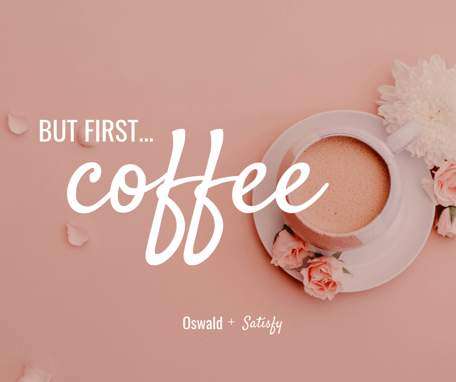
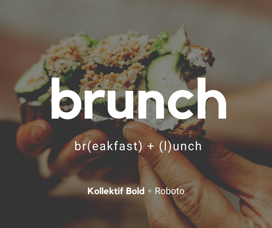
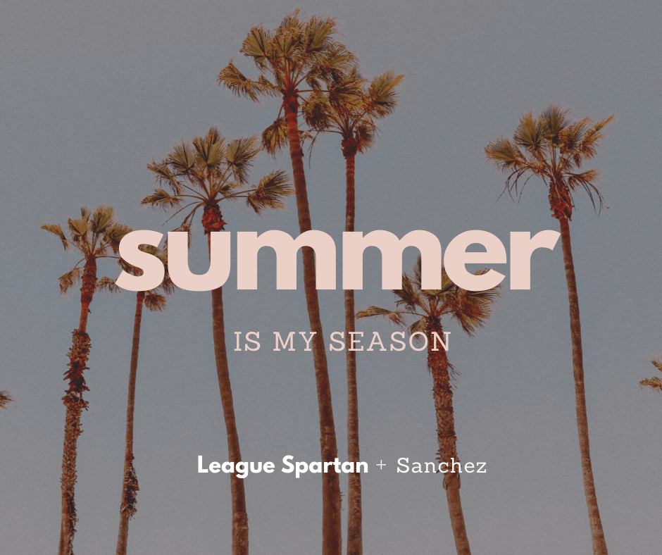
Here are some gorgeous font combinations for your next Canva designs.

Final tip:
Don’t follow trends too heavily when choosing a font for your logo. Believe me, your precious logo will date.

One way to level up the design of your graphics is to use the proper fonts at the proper time. But remember:
- Always maintain legibility. If no one can read your stuff, you have just wasted your time designing.
- Don’t follow trends too heavily when choosing a font for your logo. Believe me, your precious logo will date.
- If you have a style guide, stick to it. If not, then you can create one in Canva. Choose appropriate fonts that reflect your brand personality.
Keep this list within reach as you continue with your business designs. You can also download and print our handy ebook & keep a copy on your desktop for ready reference.


