That is why every so often I ask a client if I can review a design project I worked on for them as a case study.
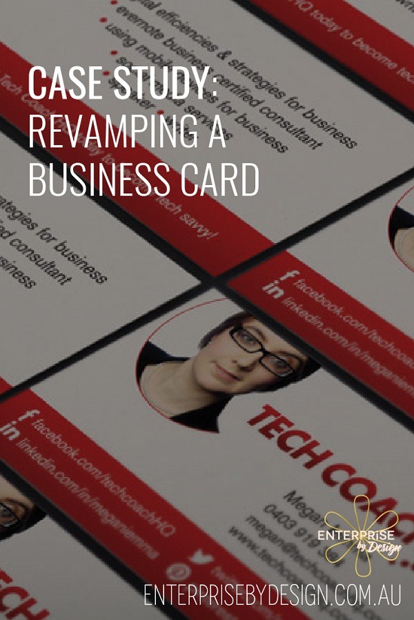
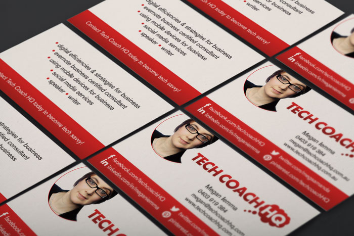
Megan is the solo business owner of Tech Coach HQ. She is a speaker & does a lot of networking so business cards are an essential part of her marketing tool kit. She was running low on the cards she designed in the early days of her business & wanted to tweek & freshen the design. That’s where my design studio came in.
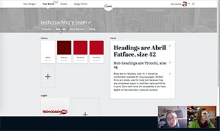
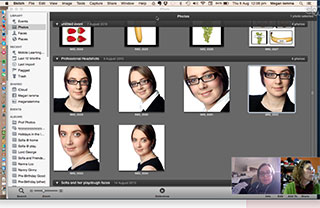
First things first, we jumped on skype for a briefing meeting. Megan had had her logo professionally designed & could supply it in a vector format*. She had a brand kit stored in Canva (for work) which included her brand colours in HEX** format & her fonts. She also had a limited number of professional headshots.


Inputting Megans colours gave the correct printers codes (ie Fire Brick or #B4031F is 0|98|83|29 in CMYK).

Next I moved on to working on the back of the card which was clumsy with no cohesion or balance between the elements. After a lengthy discussion about the value of QR codes we decided that removing the cumbersome QR code left room for Megan’s zones of genius.
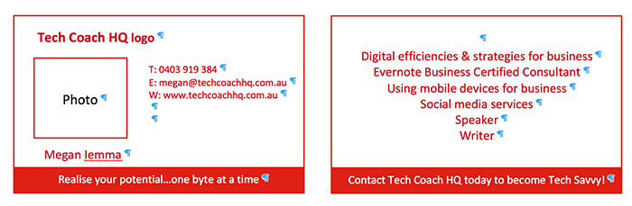
Finally the first draft was ready for comment.


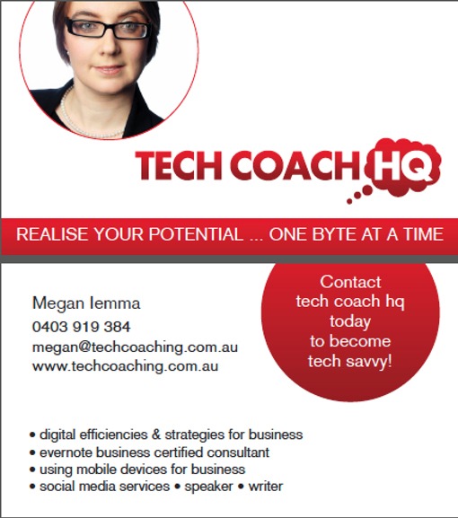
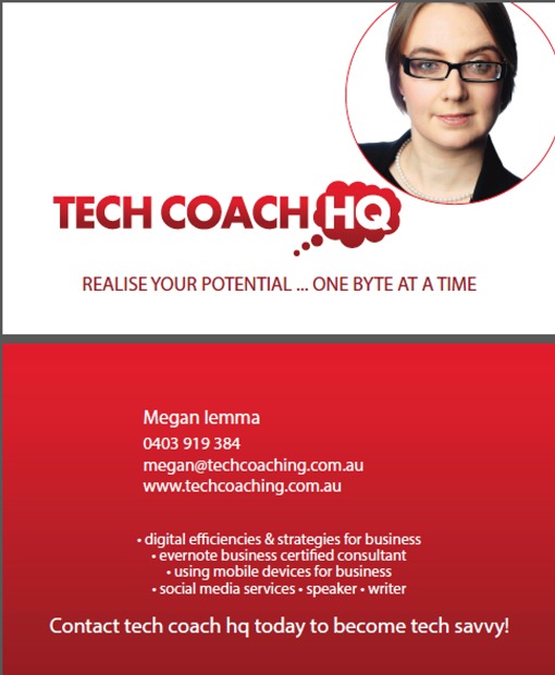
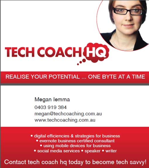

Finally we came up with the perfect solution. The result was sharp, elegant & clean.
The card was printed on a heavy bright white card, matt laminated. The logo was overlaid with a spot varnish – to just give that point of difference.
At the end of the day you have to be totally & completely excited to hand out your business cards … you should love them, be proud of them & your poential client should want to take notice of them. That’s when you know you have a brilliant business card, when people look at it, admire it, read it, talk about it.
GLOSSARY:
* Vector files such as AI, EPS & SVG can remain editable so you can open them back up in Illustrator and edit any text or other elements within the graphic. Then have clean edges & are fully scalable which is why they are great for logos. Images that contain text & are saved as a JPG, PNG or GIF are not editable. They also use a lossy form of compression when being saved which creates a loss of quality.
** The HEX (Hexidecimal) numeral system is used in websites so browsers know what colour to show.